|
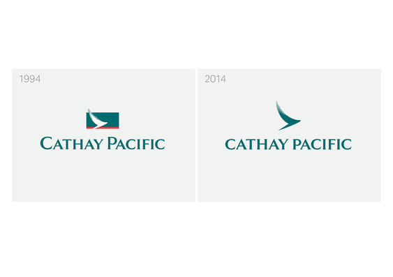
In late October 2014, Hong Kong's Cathay Pacific Airways unveiled a new logo and brand which the airline described as "a cleaner, crisper, more contemporary identity" which will "help passengers travel well."
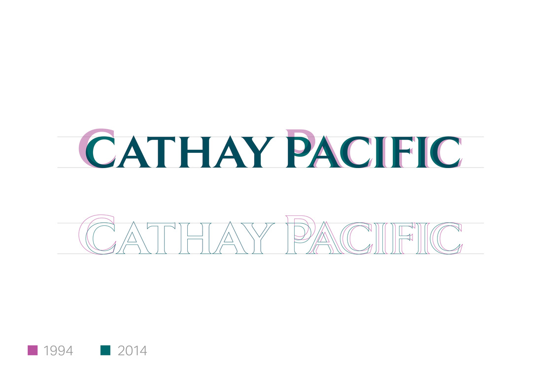
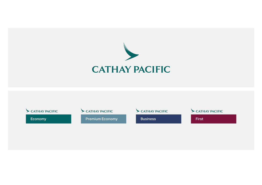
The project, which has taken 18 months to complete, will take another 18 months to fully roll out on the corporate website, airport lounges globally, aircraft cabins, in-flight service and entertainment products. The first concrete example of the brand's usage will be on the official Social Media accounts (Twitter, Facebook etc.), on the company's corporate website's landing page and at Cathay Pacific's new lounge at Japan's Tokyo Haneda airport, which will open in December, 2014. Citing reasons for the new brand and logo, Cathay Pacific Airways said said in an official statement: "Symbolising our efforts to create a better, more beautiful and more enjoyable journey for passengers, we have refreshed many aspects of our brand identity. Centred around our timeless brushwing icon, we have sought to simplify, clarify and beautify. The brushwing no longer sits constrained inside a box, and has been gently harmonised and set free. We have also defined tighter rules around sub-brands which will now be clearly aligned within a simplified, tiered hierarchy. We will also use a tighter palette of colours and typography." With increasing fuel prices in the aviation industry, airlines these days are challenged with presenting a unique and eye-catching brand identity that is simple, sleek & stylish and in touch with the modern times, yet one that uses as less paint as possible to save fuel costs (it may not seem much but paint adds a considerable amount of weigh to a plane and hence increases the fuel required). There have been many recent examples where airlines have made their corporate brand identity simpler, including China Eastern Airlines, Royal Brunei Airlines and American Airlines to name a few. I personally feel that the less paint you use on an airline, the more boring it looks as a brand identity. Although, insiders have informed me that the livery on Cathay Pacific aircraft, however, will keep its look but it may change in future years. There are also unconfirmed rumours online that the red cheatline is going to be gone from the CX livery (these don't seem to be genuine). While I understand the reasons behind the changes, but when you see designs that have been churned out by the likes of Royal Brunei Airlines and China Eastern Airlines you end up missing the 1970s and 1980s when aircraft of world airlines were lavishly decorated. Though less certainly seems to be more. These days, however, exceptions are made for low cost airlines (Easyjet, Ryanair, Air Asia etc.) where they paint their planes with large sponsorship. The brand identity changes were only announced for Cathay Pacific Airlines and not Dragonair. For more on Cathay Pacific's new brand, find our more at cathaypacific.com/thenextchapter Comments are closed.
|
About Airline PRThis is a special section on Airline Branding, and Airline Public Relations written by me on all the flights I have been fortunate enough to have been on. These are not records taken from somewhere else, but are actual flights I have been on. Most of the flight trips are officially sponsored by the airline companies in order to promote their certain routes, and aircraft. Airline promotion and PR related work in the aviation industry is one of my expertise. Watch exclusive videos below taken in the cockpit of a Boeing 777-300ER in-flight over Chinese Airspace.
Special thanks goes to Turkish Airlines B777-300ER Cockpit Video 1B777-300ER Cockpit Video 2Archives
February 2024
Airlines Reviewed
All
Proud media partner of QATAR AIRWAYS |
